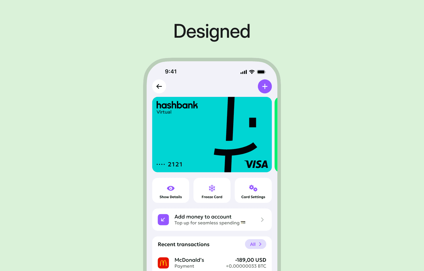
Design system: scaling speed without losing clarity
This design system powered a mobile-first digital bank and its core products. It unified UI, behavior, and logic across all features as the product scaled from zero.
Built from scratch during the hashbank MVP, it reduced design time by 55% and development time by 40%. This infrastructure supported daily shipping and two major redesigns, ensuring long-term product growth without technical debt.

Background
hashbank was built from zero in a highly regulated environment where teams repeated the same UI patterns across every new feature. This lack of structure slowed delivery by 40% and caused 50% of QA test cases to be sent back for UI-related fixes.
I conducted an audit to prove how much time was being lost to rework and inconsistency. By using these metrics, I demonstrated that continuing without a system would cripple product growth, which helped secure the agreement to build a design system while the product was live.
We developed an atomic design system in parallel with active feature development. After just two months, design speed increased by 60%, development by 40%, and UI-related bugs dropped by half, creating a stable foundation for the MVP and beyond.

The problem
The product was growing faster than its UI foundations. Each new feature introduced inconsistencies across screens and flows, forcing design and development work to be recreated instead of reused.
This slowed delivery speed and increased QA rework. Fixing recurring UI issues eventually took longer than building new features.
Without a shared system, scaling meant more bugs and slower releases. I realized that continuing this way would lead to an unstable UX that could no longer support the product’s growth.

What i did
I initiated and built an atomic design system while the product was actively shipping. Work started with tokens, then scaled into components and templates used across all features.
I aligned designers and developers around shared rules and usage. This reduced design duplication, improved handoff, and stabilized UI behavior across the entire platform.
The system increased design speed by 60%, development speed by 40%, and reduced UI bugs by 50%. These metrics proved that the system was a strategic scaling tool, not just a visual asset.
System scope & audit
01 / 09
The first step was a full audit where I reviewed the app screen by screen to collect tokenable values and UI patterns. I mapped out every color, spacing rule, and typography style alongside recurring components and page layouts to identify system candidates.

After collection, I filtered and cleaned the data to remove duplicated, unused, and inconsistent elements. By stripping away this noise, I grouped the remaining UI into clear categories—like list items and form elements—to create a stable foundation before designing a single component.
To prevent future technical debt, I reviewed upcoming feature maps with the product team to identify missing system needs early. This audit ensured the design system was not just a library of the past, but a scalable architecture ready to support long-term product growth.
Tokenisation strategy
02 / 09
I extracted all shared values from the UI, including colors, font sizes, weights, spacing, and border radius. Each value was converted into a token and reused across the product, ensuring zero hard-coded values remained in screens or components.

Tokens were organized into two levels to ensure scalability. Base tokens stored raw values, while semantic tokens defined the role of those values, such as specific text or background functions.
Every token was documented in tables with a name, value, and description. This provided total clarity for developers and significantly reduced implementation mistakes during the handoff process.
Atomic foundations
03 / 09
I started by building the smallest reusable parts of the UI, defining buttons, badges, icons, and avatars as atomic components. Each atom supported all interaction states from the start, which removed one-off styling and visual drift across the platform.

Atoms were fully driven by design tokens rather than manual values. This meant any fix at the atomic level updated the entire product automatically, ensuring total consistency without manual rework.
These foundations became the base for all larger components and templates. By securing the smallest parts first, I created a reliable building block system that supported the bank's rapid scaling.
Core components at scale
04 / 09
After atoms, I focused on the most used UI parts. List items, form inputs, selects, and cards appeared across almost every screen.
These components had many variants, states, and nested elements. Small inconsistencies here had a big impact on the product.

Each core component was designed once and reused everywhere. Behavior, spacing, and rules were defined centrally.
This removed design duplication and reduced back-and-forth with developers. QA issues dropped as component behavior became predictable.

Core components were built to support future needs. New features reused existing components instead of creating new ones.
This kept the system stable while the product continued to scale.
Reusable templates
05 / 09
After core components, I created ready-to-use templates for the most repeated page types across the product. This included standardized structures like select modals for country, currency, and category, ensuring teams stopped rebuilding the same screens from scratch.

These templates slashed setup time and kept user flows consistent across the entire app. By removing the need to debate layout decisions, designers were free to focus on functional logic and edge cases.
This shift directly improved delivery speed and eliminated layout-level bugs. It turned complex page builds into a simple assembly process, making the product faster to ship and easier to maintain.
Documentation & handoff
06 / 09
Early on, the focus was speed rather than documentation. Atoms and components were shipped immediately to unblock the product team and maintain delivery momentum.
After the first release, I added documentation for component behavior, usage rules, and edge cases. Cross-links showed exactly where each component was used across the product to ensure total visibility.

Developers received clear technical notes on states, variations, and constraints. This eliminated guesswork and reduced rework during implementation by providing a single source of truth.
The system became easier to navigate without slowing down delivery. By documenting in stages, I ensured the team stayed fast while building a highly organized foundation.
Governance
07 / 09
Core tokens and components were locked as the default path for all new work. New UI was required to reuse existing components unless a specific gap was identified, ensuring the product didn't drift back into inconsistency.
Requests for system changes were moved to weekly Design–Dev meetings rather than ad-hoc messages. This structured approach allowed us to evaluate the impact of every update and kept both teams aligned on the system’s evolution.

Urgent requests—like needing a new button in five minutes—were handled as temporary standalone components. These were never left to rot; they were later reviewed and either merged into the system, modified, or removed entirely.
This process ensured that no quick additions were left undocumented or forgotten. By treating the system as a living product, we maintained high-speed delivery without sacrificing long-term technical health.
Team enablement
08 / 09
After the system stabilized, I focused on improving collaboration. Developers were not fully comfortable with Figma or Dev Mode, so I ran daily sessions for one week to explain component usage, tokens, and handoff basics.
These sessions transformed how our teams worked together by reducing miscommunication. Developers stopped guessing values and started reading designs directly, which made handoffs faster and significantly improved implementation accuracy.

To maintain long-term clarity, I added a changelog to track every system update. Each entry described the "what" and the "why," creating total visibility across design and engineering and preventing the confusion of silent updates.
This structured approach turned the design system into a shared language. By prioritizing education and documentation, I improved day-to-day efficiency and set the stage for future goals like connecting the changelog directly to Jira for version control.
Versioning & future direction
09 / 09
To track system changes, I added a changelog that detailed the "what," the "why," and the priority level for every update. This created much-needed visibility across both design and development, preventing the confusion of silent updates.

My next step is to connect the changelog to Jira for structured version control. This will bridge the gap between design iterations and development tickets, ensuring the entire team stays aligned as the system evolves.
I also plan to implement Storybook to create a direct comparison between Figma and live code. This will allow QA and developers to test components with much higher accuracy, leading to tighter alignment between design, code, and testing.
Results
The design system became a core part of how the product was built and scaled. It reduced friction across design, development, and QA without slowing delivery, acting as a strategic scaling tool rather than just a UI asset.
By standardizing UI logic and behavior, teams shipped faster with fewer errors. The system supported continuous product growth, allowing us to launch new features in weeks and re-brand in days without redesigning foundations.
60%
Increase in design delivery speed after introducing tokens, components, and templates.
40%
Faster development due to reusable components and clear handoff rules.
50%
Reduction in UI-related bugs returned from QA.
30%
UI elements removed after audit and system cleanup.
Key Takeaways
The biggest issue was not visual inconsistency, but a lack of shared rules. Design and development teams were solving the same problems repeatedly in different ways, which drained resources.
The design system proved to be a scaling tool, not just a UI asset. It reduced duplication, stabilized behavior, and allowed teams to move faster with total confidence in their output.
Building the system while the product was live showed that progress beats perfection. I learned that a flexible foundation mattered significantly more than having complete documentation on day one.